Looye Kwekers - Brand website

Design / UX
Case description
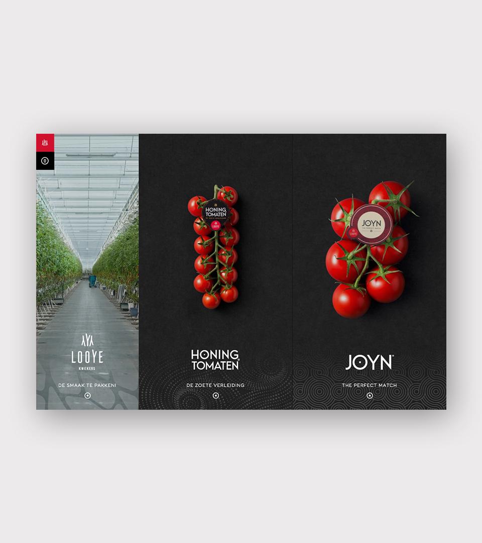
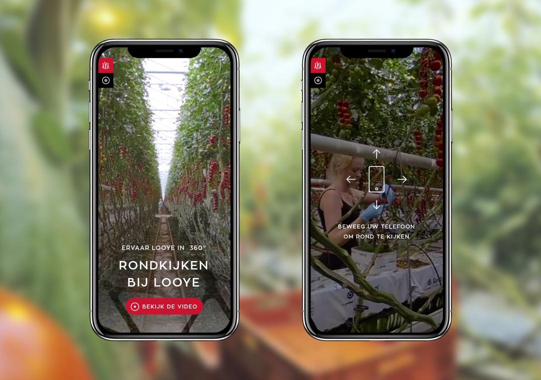
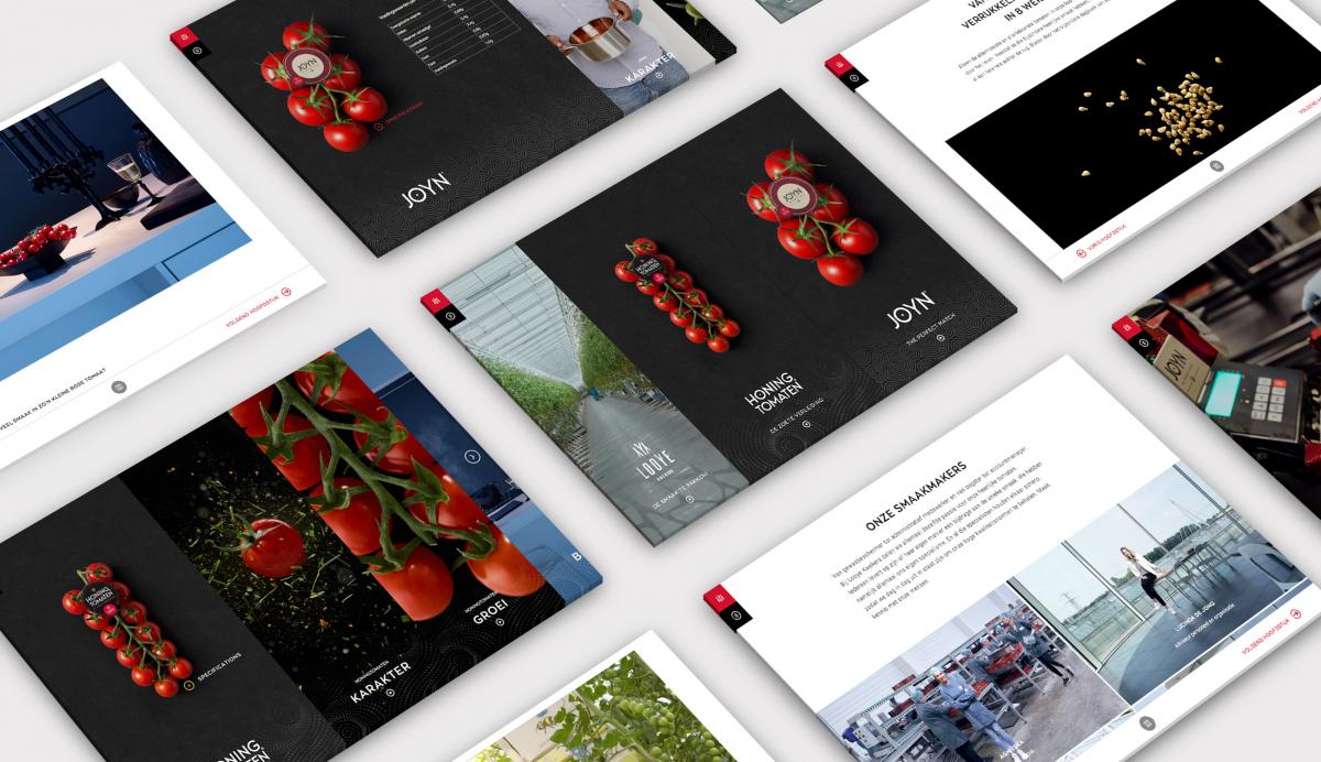
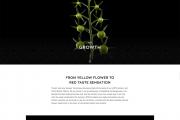
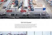
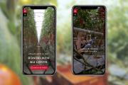
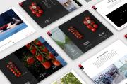
The Looye brand platform needed to appeal to two different target audiences: consumers and (potential) B2B customers such as wholesalers and retailers. Because we can’t let website visitors literally taste the high quality tomatoes, we needed to design the platform in a way that the visitors gets a digital experience of the same quality as the product itself. This all is supported by several online and offline campaigns.The result is a website that reads like a book, where in different chapters the heritage, product characteristics and applications of the tomatoes are described. The journey of the tomatoes from the greenhouse to the vegetable shelf in the supermarket has been fully documented, supported by custom made photography as well as 360º videos. Recipes inspire visitors to get creative and use the JOYN® tomatoes in new ways. Finally, the website also plays a big role in recruitment by explaining and showing Looye’s heritage and company culture.
*Technical specs*
- Drupal 8, headless
- React front-end
- Component based CMS setup for flexibility in content management
- Digital Asset Management integration; all images are imported through Cloudinary DAM
- MailChimp integration for newsletter subscriptions
- Multilingual: Available in 4 languages
- Up to quality standards such as SEO, accessibility and GDPR compliance
Case goals and results
Since the launch of the new platform Looye Kwekers has conducted research to the effects of the new website, and the results don’t lie. Brand awareness of Honey Tomatoes has risen from 13% to 32% and that of JOYN® from 7% to 15%. The sales volume of Honey Tomatoes grew with 19% and that of JOYN® with 158%. The consumer index rose from 6.9 to 8.0. Both Honey tomatoes and JOYN® are now available at large retail chainsChallenges
1. The 360º HD videos work very well on the latest mobile phones and handheld devices, however it has proven difficult to make the also performant on high resolution screens, because of the increase in file size and rendering needs for larger screens. To show how difficult it is, just open any 360º video on YouTube, set it to the highest resolution and play it full screen (e.g. https://www.youtube.com/watch?v=-xNN-bJQ4vI). We expect to launch an update to this feature in June 2019.2. The front-end is very visual and contains a lot of motion design. Our front-end developers had to be at their best to pull off this great result.
Community contributions
The project is developed with our own headless Drupal 8 and React framework called Headless Ninja (HN). It is fully open sourced and consists of multiple smaller sub modules for easy extension and high performance. By also publishing the Javascript parts on NPM a headless React/Drupal website can be created instantly. More info on https://headless.ninja/.Besides this we always raise issues if we come across them and submitted patches where we can. Examples:
https://github.com/DAB0mB/graphql-tag-pluck/issues/5
https://github.com/DAB0mB/graphql-tag-pluck/issues/3
https://github.com/DAB0mB/graphql-tag-pluck/pull/4https://github.com/prettier/tslint-config-prettier/issues/168
Why should this case win the splash awards?
This is not you everyday brand website. It shows that designs of Drupal websites don't have to be standard and boring, and thanks to the photography you can almost taste these great tomatoes.Also, since it is the category Design/UX, we were fully responsible for everything design related. Everything is created specifically for this project:
- Strategy, concept & design
- Art direction
- UX, visual and motion design
- Content creation & copy writing
- Photography and (360 degree) video production

