Cornell University's Sustainable Campus

Design / UX
Case description
platform change. The previous Ruby on Rails solution was not offering the flexibility that the team desired and was creating difficulties as the team needed to go to an outside vendor for assistance with general maintenance and upkeep. The Sustainable Campus team wanted the option to handle updates and general maintenance internally. Additionally, they wanted to be able to easily update the website content and design elements. Cornell’s Information Technology (CIT) Custom Development team was brought on to assist with a custom redesign, a User Experience effort, development of the site in Drupal that met WCAG 2.0 accessibility guidelines, and training for internal staff on the Drupal platform. The custom web project was broken up into the following three phases:Phase 1: User Experience Evaluation. The first phase of the website redesign was to perform a User Experience phase in which the UX specialists performed a competitive analysis of similar institutes’ sustainability websites, looking at indicators including total traffic snapshots, user retention on the sites, and general page structure comparisons.
Once this was completed, interviews were performed with a cross-section of site users including faculty, students, staff, community members, and core communicators. Each of these user groups was also sorted into categories of either “Curious” or “Knowledgeable” about the site and its content. Specifically, the “Knowledgeable” group is someone who knows what they want, for example, a phone number, and the “Curious” group would include someone interested in learning about what's going on at Cornell. During this phase, it was discovered that the user categorization of either “Curious” or “Knowledgeable” had more of an impact on the users' needs than if the user differentiator of Faculty or a Student were used. These two user groups had different tasks, goals, and pain points. After mapping out the needs and other information gathered, a final Informational Architecture was developed and the design phase began.
Phase 2: Design. There were some key challenges for the design phase of the Sustainable Campus website:
Branding. The website owners needed to create a “Cornell University” branded website, but the brand color of Cornell was too strong for the website. They were interested in cooler colors that gave off a feeling of sustainability but were apprehensive of having anything too green, as they didn’t want to create a typical all green sustainability website.
Usability. Both “Curious” users and “Knowledgeable” users needed to find the information they were looking for. With varying and sometimes conflicting interests, a solution that addressed the competing needs of both groups without making the site difficult to navigate for either group was necessary.
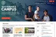
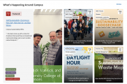
Design. Towards the three-quarter mark of the website, the Sustainable Campus team came to Custom Development and requested a partial redesign of the homepage as they had changed the purpose of their website. What was before a more traditional blog/news feature needed to take on a more of an overarching informational feel to the site.
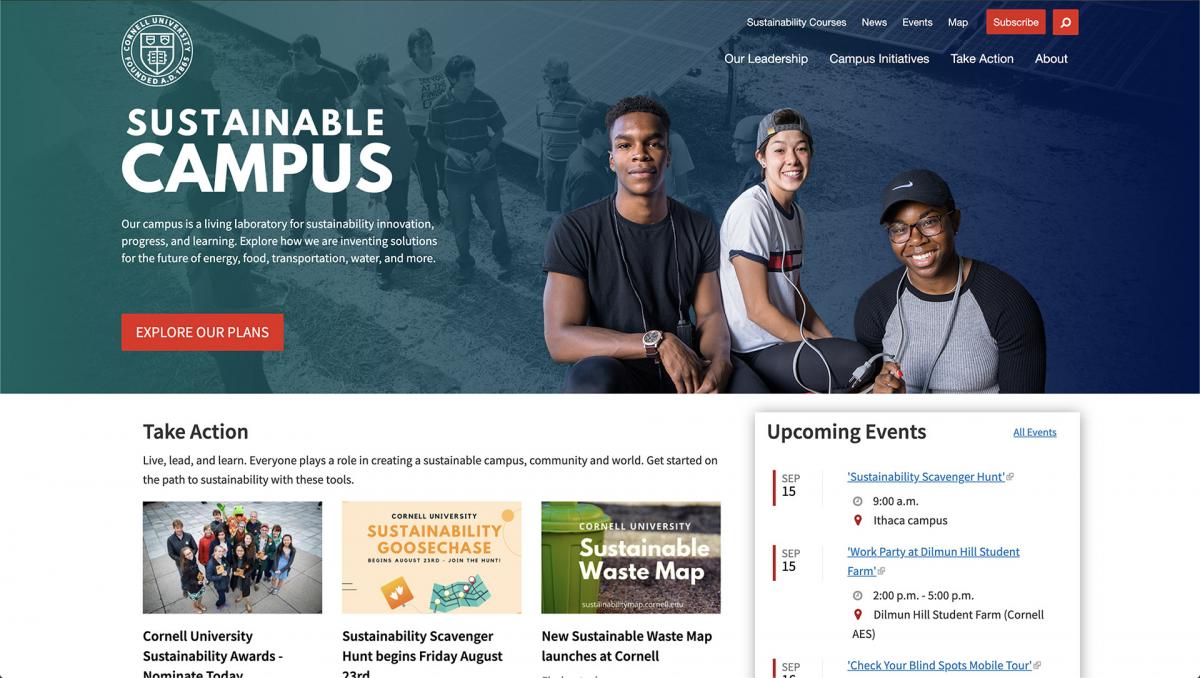
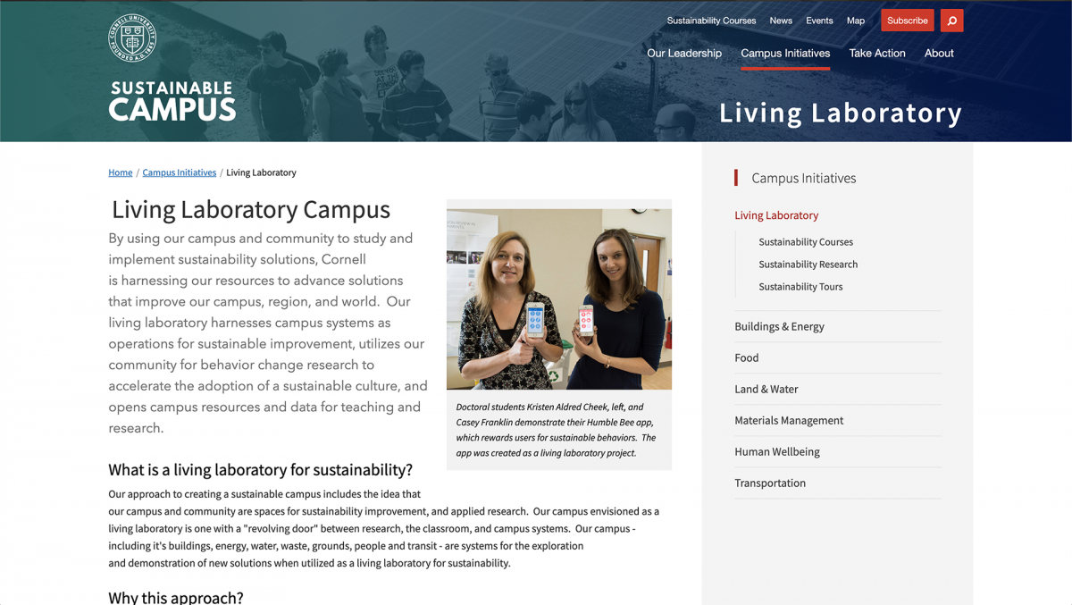
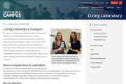
The challenges ultimately ended up revealing that the Sustainable Campus site really focused on a few main topics/areas. Interestingly, and especially challenging, is that the further the project progressed the more it became clear that the original concept would need to be modified, which resulted in a critical pivot in concept and design. It became clear that the Living Lab was one of the main ‘take action’ features and therefore it ended up driving much of the homepage design and feature order.
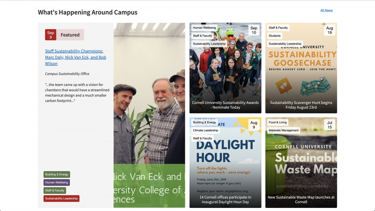
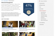
Phase 3: Migration. The final component of the Sustainable Campus website was to migrate over to Drupal 8. A large struggle with this migration was the sheer amount of content and the duplicative content that was present on the previous site. The developers needed to create all the basic elements of the site including content types for the news, events, initiatives/action areas, and spotlights. They also needed to introduce a taxonomy structure for the website that at times was difficult to get Drupal 8 views to work with. The taxonomy of the sites would allow users curated content that was “general content” but also enabled them to quickly find other related content.
In addition to these phases, Cornell University recently put a policy into place that required all sites that went live to be WCAG 2.0 Compliant. To this end, a custom integration between CKEditor and a11ychecker was implemented that overcame limitations of the then status of CKEditor in Drupal 8. This allowed content contributors to be able to write and post accessible materials to the site.
Case goals and results
The Sustainable Campus redesign focused on the following three goals:Goal 1: Create an all-in-one Sustainability website for Cornell where users can quickly and efficiently see the status of initiatives across campus and find the information they are looking for.
The result: Through the use of tagging, multiple focus areas became interconnected, which makes it easier for interested parties to find the information they are looking for, as well as related initiatives.
Goal 2: Have a site that was flexible and easy for internal teams to update content and maintain the website without the need for constant assistance from outside vendors.
The result: By replacing a completely custom system with Drupal, content editors have the flexibility to go into the platform to make updates directly to the site. Specifically, the content types of Drupal allow users to easily upload images and to edit and format content with minimal training, as the interface is very straightforward and appealing to users of varying technological prowess.
Goal 3: To create a fresh and modern website that was open and responsive, as well as accessible to users, meeting WCAG 2.0 guidelines.
The result: In order to create a fresh and modern website that was designed to look great and to be accessible on all devices, the site was built with accessibility in mind first. The approach to tackle accessibility from the very beginning of the project, rather than trying to make the design accessible after it was complete distinguishes this project from many of its peer sites. Not only did this approach enabled us to keep the design in alignment with the accessibility standards, but it resulted in fewer design changes and the disappointment that typically arise from designing first and then having to adapt the designs to meet accessibility requirements later. Additionally, while it may take up more time upfront, fewer changes are typically required later, resulting in a more time-efficient and cost-effective end result.
Challenges
There were two main challenges that were encountered during the redesign.Tagging. Large overlapping sets of content needed to be presented in a way that was fresh, but also allowed for easy access. This included a complex tagging structure of content, but also related content to that area.
The Solution: The solution to this challenge was to carefully create a taxonomy structure that allowed for flexibility when tagging items that could later be leveraged in multiple parts of the site.
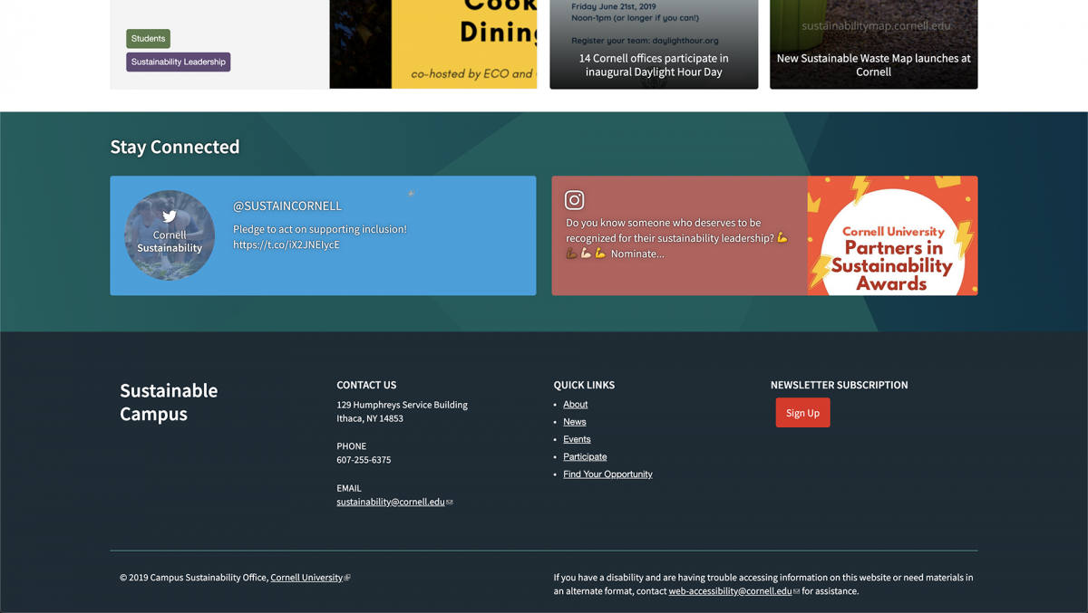
Modules. A previously used Instagram module, “Instagram Block” was being deprecated, and was expected to stop working. The Instagram API itself had fairly restrictive and legalistic implications on how an app could be built or modify Instagram content.
The Solution: To overcome this challenge it was necessary to create a custom module that would scrape an Instagram page for content at a set interval and could pull data including images, captions, time creation, comments. It also allowed us to control the downloading of an image vs. that of a video, where videos were not desired in the area that the Instagram module was used. When the data is collected, then a designer or developer could easily use the content types with Views and styling to display the data as desired.

